Dashboard
The Dashboard is the landing screen of HurPal CRM. It gives you a customizable, widget-based overview of sales performance, pipeline health, and daily activity. You can create several dashboard layouts, switch between them, and choose which widgets appear and how they are arranged.
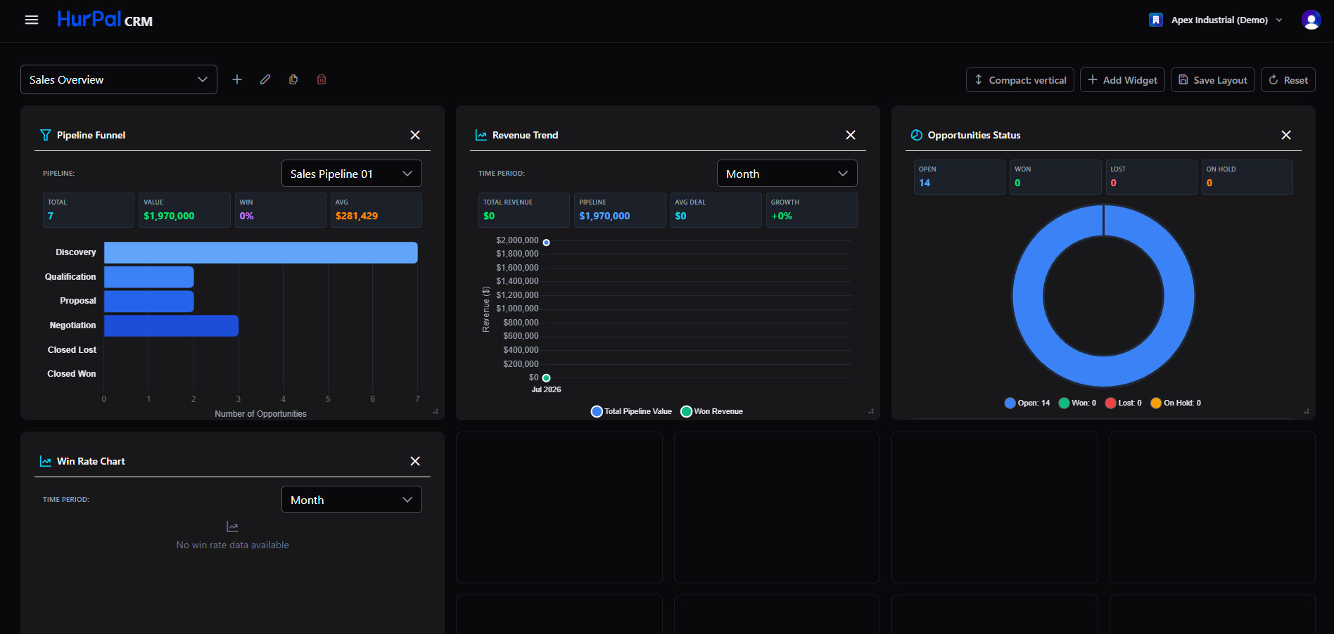
The dashboard toolbar
The toolbar at the top of the screen manages your dashboard layouts.
| Control | What it does |
|---|---|
| Layout selector | Switches between your saved layouts (for example "Sales Overview"). |
Add (+) | Creates a new dashboard layout. |
| Edit (pencil) | Renames or edits the current layout. |
| Duplicate (copy) | Copies the current layout as a starting point for a new one. |
| Delete (trash) | Deletes the current layout. |
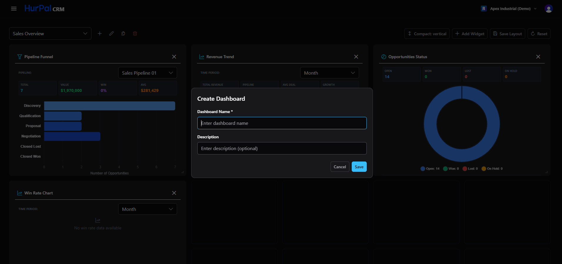
On the right of the toolbar:
| Control | What it does |
|---|---|
| Compact toggle | Changes how tightly the widgets are packed on the grid. |
| Add Widget | Opens a picker to add a new widget to the layout. |
| Save Layout | Saves the current arrangement and widget settings. |
| Reset | Returns the dashboard to its default layout. |
Changes to a layout (widgets added, removed, resized, or rearranged) are kept only after you click Save Layout. If you leave the screen without saving, those changes are lost.
Working with widgets
Each widget is a self-contained card with its own header (icon and title), a close button to remove it from the layout, and a handle in the bottom-right corner to resize it. Many widgets also have a filter (such as time period or pipeline) to adjust the data shown.
You can remove a single widget with its close button without affecting the rest of the layout. To add a widget back, use Add Widget.
Default widgets
The default Sales Overview layout includes the widgets below.
Pipeline Funnel
Shows the pipeline for a selected pipeline broken down by stage (Discovery, Qualification, Proposal, Negotiation, Closed Lost, Closed Won). The summary metrics at the top are:
- Total: number of opportunities
- Value: total pipeline value
- Win: win rate percentage
- Avg: average deal value
A horizontal funnel chart shows the number of opportunities at each stage. Clicking a stage opens the related opportunities.
Win Rate Chart
Shows win rate trends over a selected period (for example by month). The summary metrics are:
- Win Rate: percentage of opportunities won
- Total Won: count of won opportunities
- Total Lost: count of lost opportunities
- Avg Cycle: average sales cycle length in days
A combination chart shows Won and Lost opportunity counts as bars, with a win rate trend line plotted against a secondary axis.
Opportunities Status
Summarizes current opportunities by status (Open, Won, Lost, On Hold), each shown as a count. A donut chart shows the proportion of each status with a matching legend.
Revenue Trend
Tracks revenue over a selected period. The summary metrics are:
- Total Revenue
- Pipeline value
- Avg Deal
- Growth, the percentage change, shown in red when negative
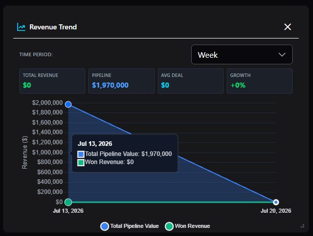
An area chart plots total pipeline value and won revenue over time. Hover a point on the chart to see the exact values for that date.
Activities Feed and Tasks
Two further widgets are reserved for a feed of recent activity (calls, emails, meetings, and notes) and for your upcoming or outstanding tasks.
Using more than one dashboard
You can create several layouts for different purposes, for example a "Sales Overview" for reps and a "Manager View" for leadership, and switch between them with the layout selector.